Designed to be Seen: Art and Function in Chicago Mid-Century Film
The New World: Industrial, Corporate and Sponsored Films brings together films produced for clients including Republic Steel, Life Magazine, Kimberly-Clark Corporation, and the Container Corporation of America that illustrate the impact of design on everyday life and product manufacturing. Films produced by Goldsholl Design Associates challenge conventions of the sponsored film through the use of experimental editing and camera techniques. Films produced for the Container Corporation of America bring us inside the company and illustrate corporate culture, values, and technological innovations. New products and manufacturing processes are showcased and the impact of good design—both on producers and consumers—is emphasized throughout the program. These corporate clients entrusted filmmakers and designers working in Chicago to breathe creative energy and life into films about subjects that don’t typically excite a general audience (the various uses of stainless steel, cardboard packaging, a new plastic printing paper, etc.).
Presented in partnership with the Chicago Humanities Festival and introduced by design historian Lara Allison, this program introduces the scope of the series by proposing that film, perhaps like no other medium of communication, could humanize institutions, new technologies, and new materials—it possessed the ability to make these new developments in the modern world both understandable and approachable.
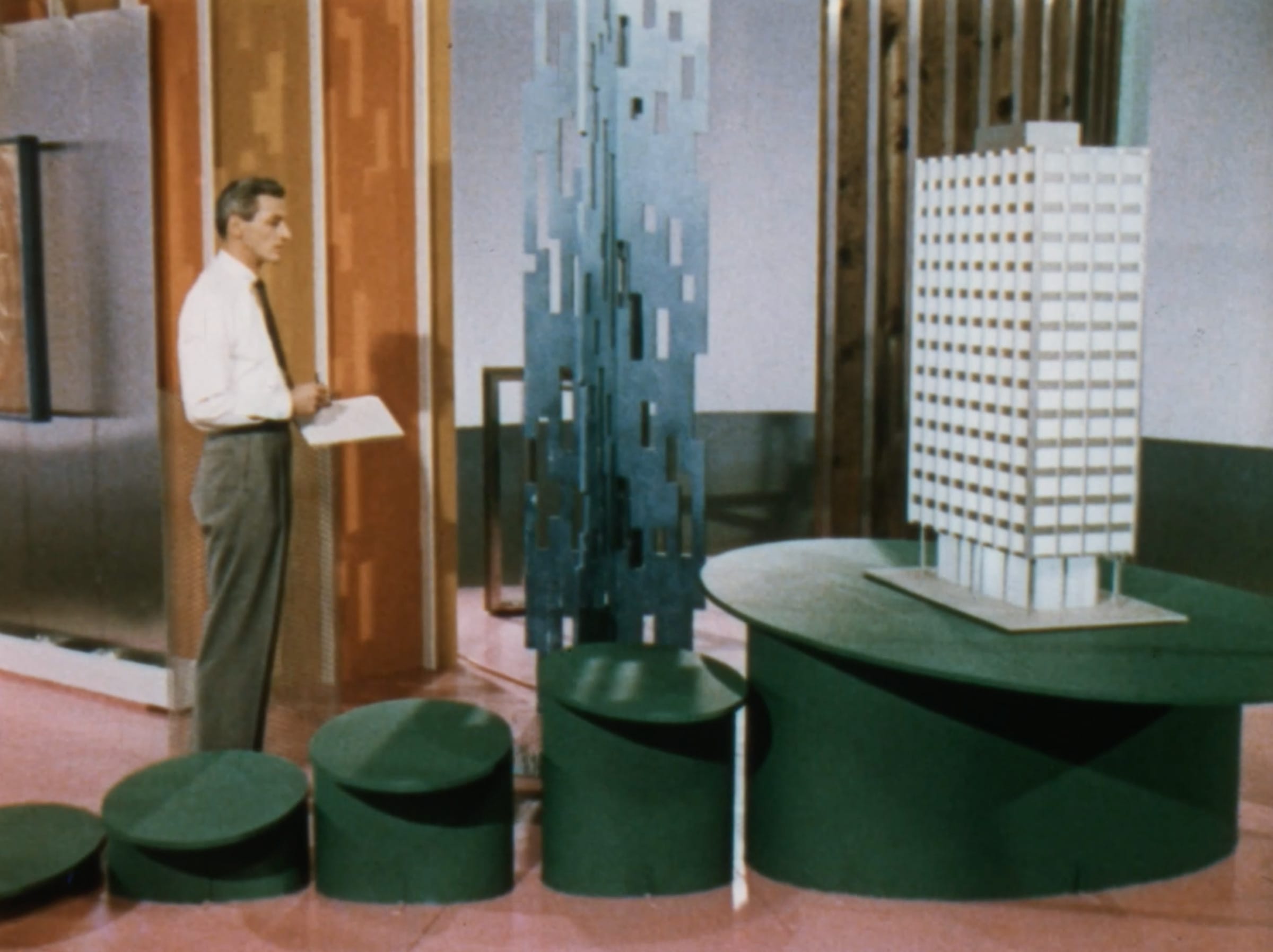
In the first film of the program, The New World of Stainless Steel, the narrator begins by describing the material attributes of stainless steel—it is resistant, strong, and hygienic, and has many applications ranging from canning goods to building skyscrapers. The most interesting thread embedded in the film, however, is the suggestion that the material of stainless steel extends beyond its materiality to the world of ideas. The narrator states: “The steel industry grows and feeds on ideas. Stainless steel is a metal that encourages ideas because it can give them shape and substance in almost limitless variety.” The notion that materiality could achieve form through the creative act of manifesting ideas is the most central (and surprising) premise of the film.
It is suggested that stainless steel had aesthetic as well as functional potential. It could do, in the in the words of the narrator, vital work or catch the eye. The optimism of The New World of Stainless Steel is matched in other films included in this program, and reflects a widespread attitude prevalent during the immediate post-war period. There was an optimism surrounding materials such as stainless steel and plastics and their applications, the merging of intellectual ideas with materials and manufacturing, and the resulting—seemingly infinite—horizon of new inventions and types of material goods for the enhancement and transformation of everyday life.
Designers play an important role within the film and were a key part of the film audience. They were identified as strategists for the material’s employment in automobile design, architectural design, and as generalized inventors of new forms. These designers were the critical link during the post-war era between materials, producers, and the consuming public.

Wilding Picture Productions, Inc., the studio that produced The New World of Stainless Steel, was based in Chicago between the late 1930s and the early 1970s, and was one of the world’s largest producers of industrial films. The studio produced films for Ford Motor Company, Chrysler Corporation, Goodyear Tire & Rubber Company, General Electric Company, Aluminum Company of America, and Standard Oil Company, among many others. As corporations became increasingly complex organizations closer to the middle part of the century—with various divisions and specializations—a corporation’s identity needed to be unified so that the public could relate to it as a singular entity. This often resulted in films like The New World of Stainless Steel as companies attempted to humanize their identity by connecting it to the cultural and intellectual tenants of contemporary art movements.
CCA & You: Partners in Achievement and WRAPAK: Your Packaging Answer? were commissioned by Container Corporation of America (CCA), a packaging company founded in 1926 by Walter Paepcke. Paepcke and his wife Elizabeth were supporters of László Moholy-Nagy’s New Bauhaus (later reorganized as the School of Design and then the Institute of Design) and, as early as 1937, Paepcke initiated an advertising campaign in which modern and avant-garde artists were commissioned to illustrate the positive attributes of the company. He hired a full-time art director to design and oversee the modernization of all visual elements of the company—from the logo to the offices, bathrooms, showrooms, cafeteria, factory floors, delivery trucks, letterhead, and invoices, etc. Container Corporation was one of the earliest American companies to establish an in-house design department.

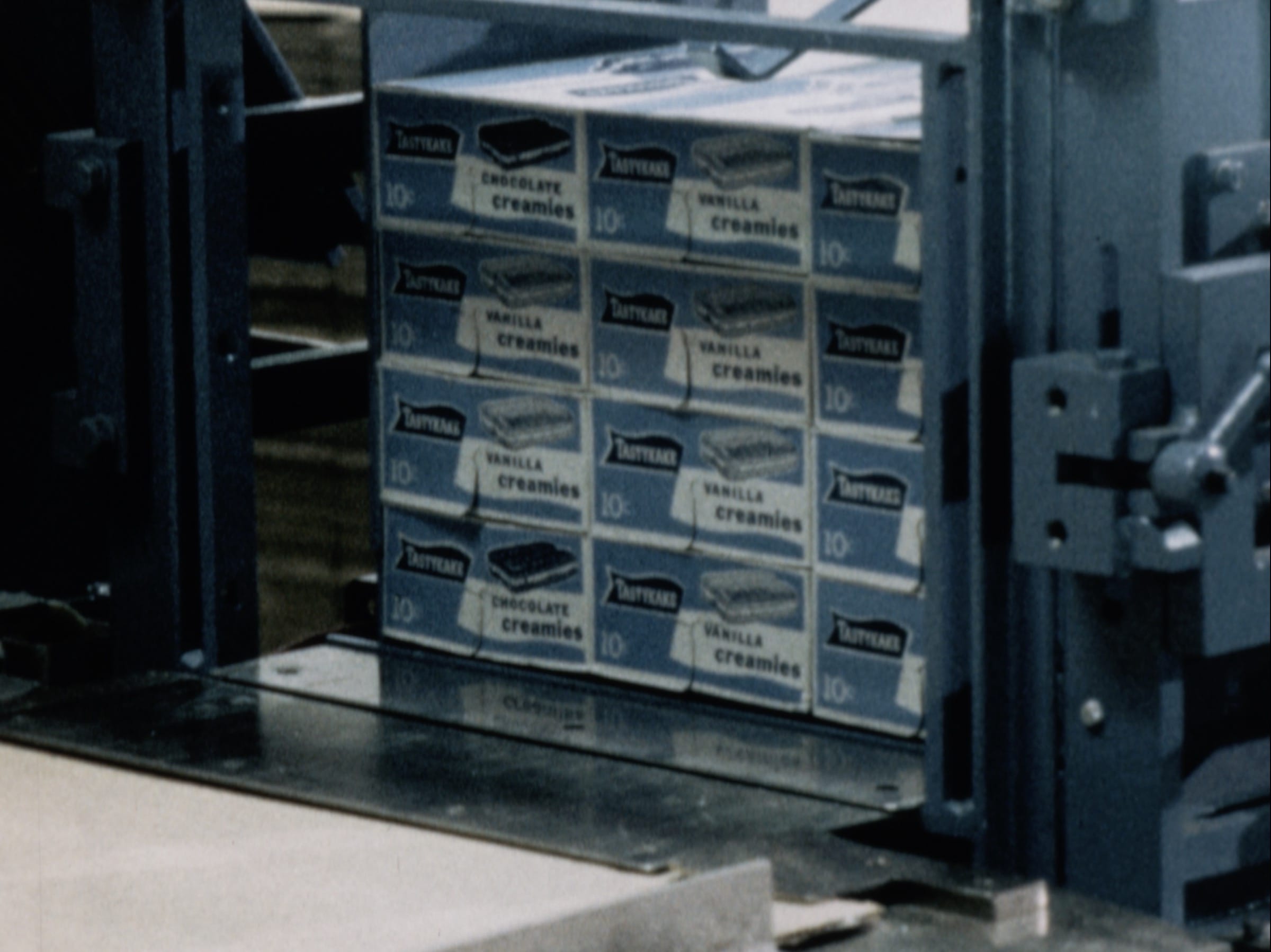
Paepcke recognized the essential role that packaging would play in the consumer landscape following WWII—as the first point of contact between the consumer and manufacturer, and as an extension of the product itself. In WRAPAK: Your Packaging Answer?, Container Corporation’s approach to packaging is shown not as an afterthought to a client’s product, but as an integral part of it.
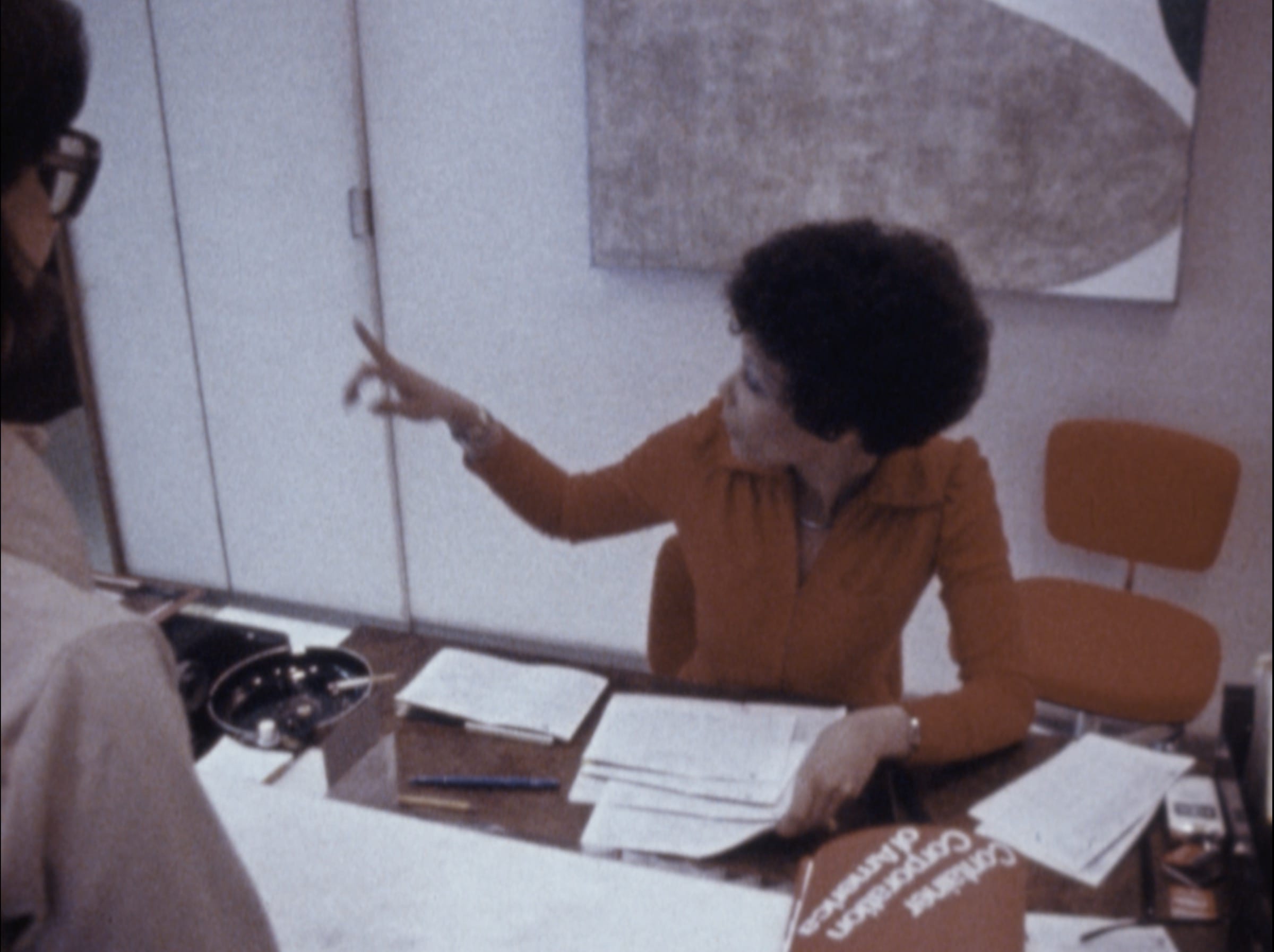
Addressed to new employees of the company as an introduction to the philosophy and general ethos of the Container Corporation of America, CCA & You: Partners in Achievement begins with the premise that CCA is and established and distinctive organization. Employees were filmed at work in an effort to express the pride that CCA’s workforce felt through their affiliation with the company—a company that became well known to the public largely through its advertising in magazines such as Time, Fortune, Newsweek, and Business Week.
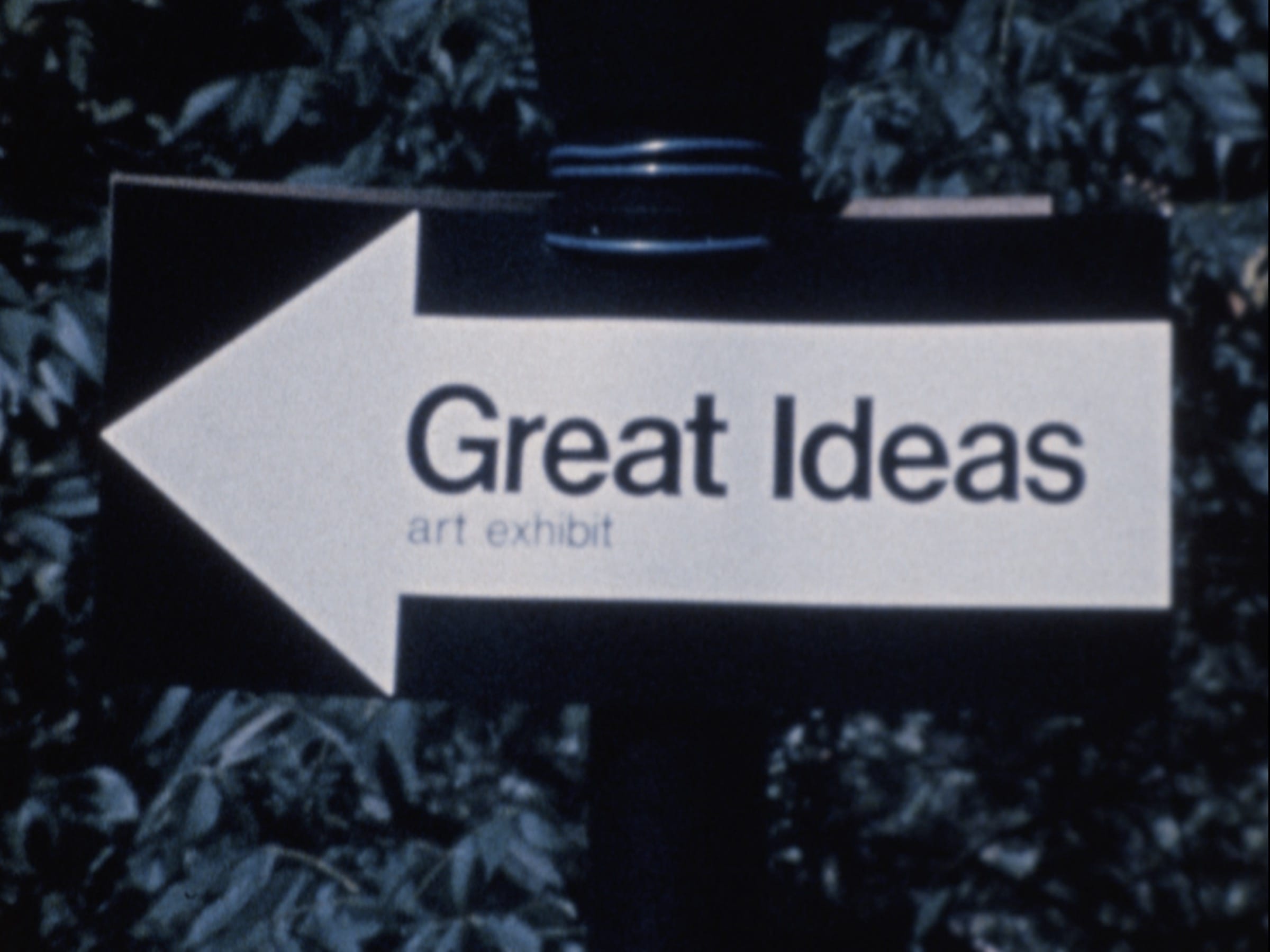
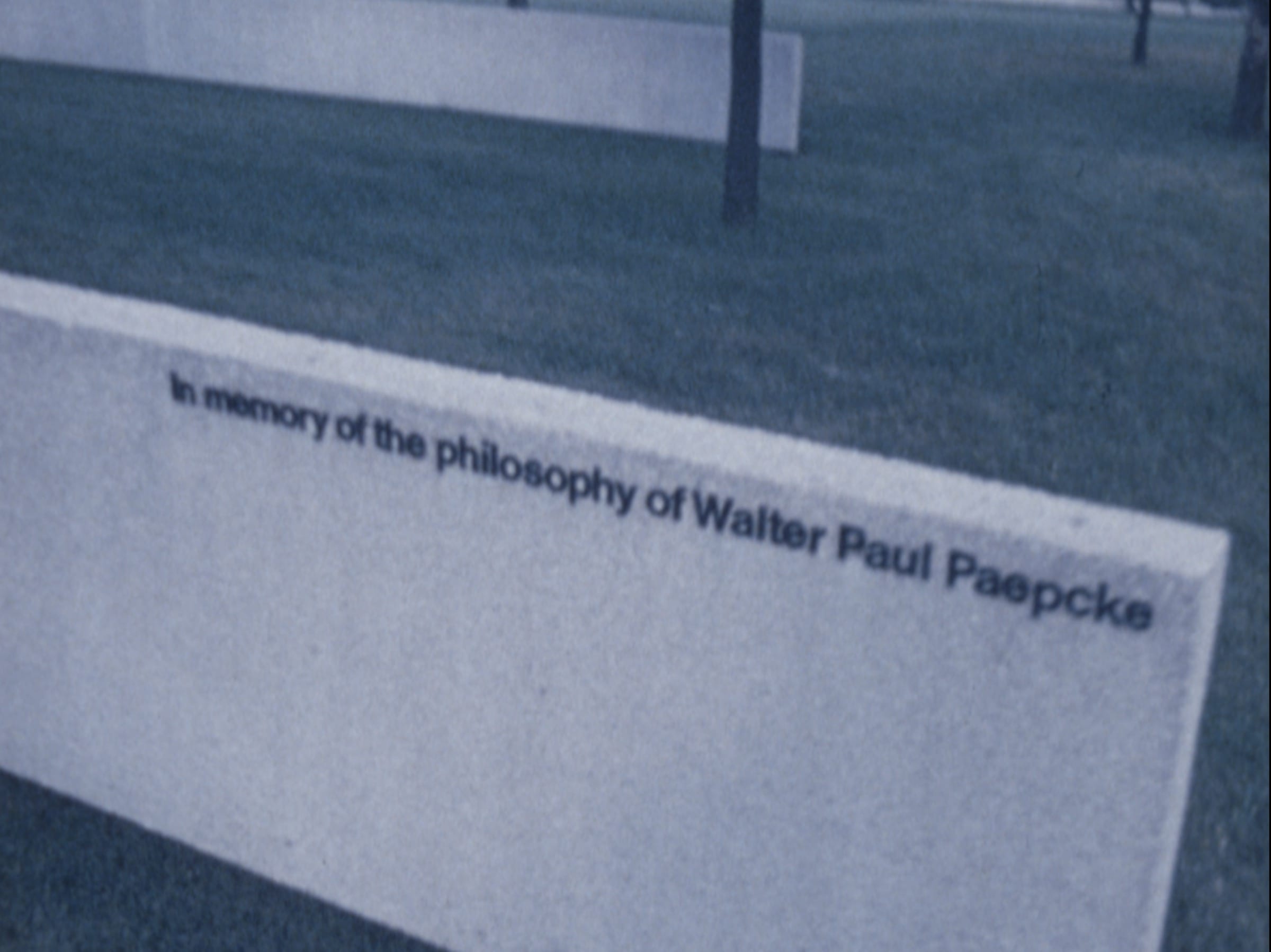
The still on the right above shows the modern office buildings at the Carol Stream headquarters of Container Corporation. The concrete panels (one of which says “in memory of the philosophy of Walter Paepcke”), were laid out in an abstract and modern arrangement on the corporate campus and displayed quotations from writers, philosophers, and educators. What began in 1950 as the “Great Ideas of Western Man” advertising campaign gradually evolved from the company’s public relations department into an all-encompassing corporate philosophy. In the final sequence of the film, the “Great Ideas” are referred to as an enduring corporate philosophy that adhered to the classical regard for individual choice and potential. The appropriation of freedom through the employment of the artist in advertising, the celebration of the merger of art and business in modern and avant-garde graphic design, and the collusion of corporate public relations with public service were all key parts of the company’s desire to spread Western democracy and free market capitalism.

The desire to work with contemporary artists and designers to solve problems of corporate expression was always at the forefront of Paepcke’s mind. For Paepcke, any collaboration between the business person and the artist needed to be grounded in a shared interest to contribute to the advancement of culture. As Paepcke wrote in the 1945 essay Art and Industry: “The artist and the business person should cultivate every opportunity to teach and supplement one another, to cooperate with one another, just as the nations of the world do.” Contemporary readers of these ads did not learn about the new packaging technologies Container Corporation was using or recent packaging work that they had done for various clients, but, rather, they understood the company to be a promoter of ideas, culture, collaboration, and democratic freedom.
The final three films in the program, all produced by Goldsholl Design Associates, are simultaneously promotional and educational, informational and playful. The influence that the School of Design and Moholy-Nagy had on the Goldsholls really comes across these short commercial films—both in terms of their use of film as a medium of design, but also their embrace of the idea that modern life required new forms of expression.
In the image sequence above we see the evolution of the subject who, through the education that she gains from reading Life Magazine, learns to accept modern design.
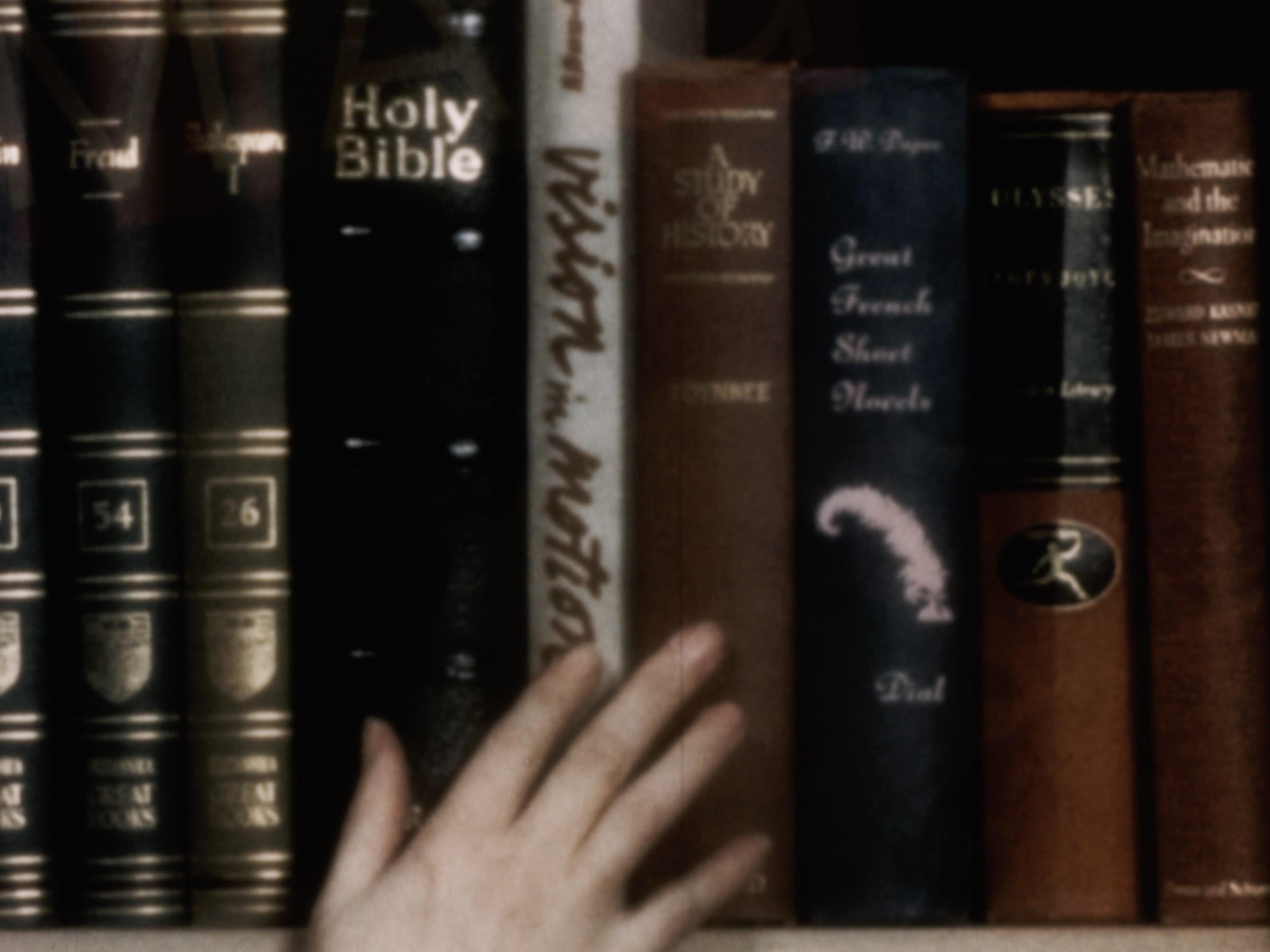
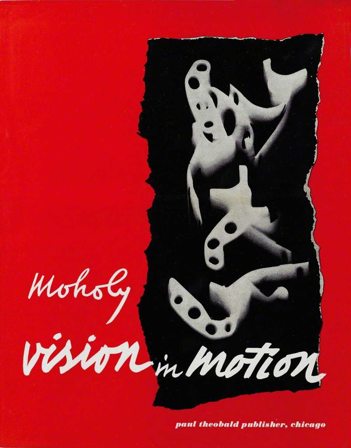
Sometimes a more direct reference to Moholy-Nagy comes into play—as seen above, in which his profoundly influential book Vision in Motion finds its place among the set of Encyclopedia Britannica’s Great Books of the Western World and the Bible. In Vision in Motion Moholy-Nagy states that the artist or designer must not turn away from contemporary life and its institutions but rather “search the new dimensions of the industrial society and translate the new findings into emotional orientation.” Through their work in film, the Goldsholl Studio sought to achieve the fundamental premise laid out in Vision in Motion—namely to bring seeing, feeling, and thinking into a simultaneous arrangement that could temper the chaos of modern life and produce emotional harmony to subjects living in the modern world.
Films in order:
- The New World of Stainless Steel (Produced by Wilding Studios for Republic Steel, 1960, color, sound, 16 minutes)
- CCA & You: Partners in Achievement (Produced and directed by Rhodes Patterson for the Container Corporation of America, 1976, color, sound, 5 minute excerpt)
- WRAPAK: Your Packaging Answer? (Produced by Container Corporation of America, circa 1968, color, sound, 7 minutes)
- Kimberly-Clark Corporation “Texoprint” (Produced by Morton Goldsholl Design Associates for Kimberly-Clark Corporation, circa 1960, color, sound, 14 minutes)
- Champion Papers: Imagination 11 (Produced and directed by Morton Goldsholl for U.S. Plywood-Champion Papers, Inc., 1967, color, sound, 5 minutes)
- Life Magazine “Mag” (Produced by Goldsholl Design Associates for Life Magazine, 1959, color, sound, 13 minutes)

Creative Broadcast: Communication, Commercials and Advertising highlights the innovative ways in which artists and designers used the moving image to both tell and sell the stories of their time. The program consists of a wide variety of commercials produced by the Goldsholl Studio and Mike Gray Associates in the 1960s and 70s—two very different studios with two very distinct approaches to marketing products and ideas. Introduced by Michael Golec, Chair and Associate Professor of Art and Design History in the Department of Art History, Theory & Criticism at the School of the Art Institute of Chicago, it is clear that these films (and the artist-designers who made them) emerged out of a context defined not just by the commercial advertising industry, but one that was heavily influenced by György Kepes’ idea that design could inspire positive social action. These are films that are infused with a deep understanding of the graphic and pictorial symbol as it permeated the media landscape of the moment.
Films in order:
- American Republic Insurance “Eagles” (Produced by Goldsholl Design and Film Associates, directed by Tom Freese, 1975, color, sound, 12 minutes)
- Joseph Schlitz Brewing Company “Schlitz Malt Liquor” (Produced by Goldsholl Design and Film Associates, 1963, color, sound, 3.5 minutes)
- A.B. Dick Company “Machines” (Produced by Mike Gray Associates, Inc., circa 1965, color, sound, 1 minute)
- Campbell-Mithun, Inc. “Ac’cent Sales Film: The Honeymooners” (Produced by Goldsholl Design and Film Associates, circa 1971, b/w & color, sound, 4 minutes)
- Satin Plus Paints “Trilogy” (Produced by Mike Gray Associates, Inc., circa 1968, color, sound, 1 minute)
- Alert Soap “The Perfect Bar of Soap” (Produced by Mike Gray Associates, Inc., 1969, color, sound, 1 minute)
- Purify Breath Mints “Wrestling” (Produced by Mike Gray Associates, Inc., 1966, b/w, sound, 1 minute)
- AMF “Homko Mowers” (Produced by Mike Gray Associates, Inc. for American Machine and Foundry Company, 1968, color, sound, 1 minute)
- Chicago American “Trucks” (Produced by Mike Gray Associates, Inc., 1967, color, sound, 1 minute)
- Sears, Roebuck and Company “Recording Studio” (Produced by Mike Gray Associates, Inc., 1968, color, sound, 1 minute)
- Sears, Roebuck and Company “Crawling Baby Doll” (Produced by Mike Gray Associates, Inc., 1968, color, sound, 1 minute)
- United Airlines “Party” (Produced by Mike Gray Associates, Inc., 1971, color, sound, 1 minute)
- Bunker Ramo Composite (Produced by Mike Gray Associates, Inc., 1970s, color, sound, 5 minute excerpt)
- Magazine Publishers Association “First Impression” (Produced by Goldsholl Design and Film Associates for the Magazine Publishers Association, 1965, color, 11 minutes)
- Flavor-Kist Cookies “Crunch” (Produced by Mike Gray Associates, Inc., 1967, color, sound, 1 minute)
- Quaker Oats Shredded Wheat “Wager” (Produced by Mike Gray Associates, Inc., 1968, color, sound, 1 minute)
- Karoll’s Department Stores “Santa Claus” (Produced by Mike Gray Associates, Inc., 1969, color, sound, 1 minute)
- Blue Cross Blue Shield “Breakfast” (Produced by Mike Gray Associates, Inc., 1967, b/w, sound, 1 minute)
- Commonwealth Edison “A, B, C” (Produced by Goldsholl Design and Film Associates, circa 1979, color, sound, 2 minutes) — this film is at 00:11:20 in Mort’s Personal Reel (F.2010-01-0033), a reel compiled by Mort Goldsholl.
- Blue Cross Blue Shield “We Need Each Other” (Produced by Mike Gray Associates, Inc., 1972, color, sound, 1 minute)

Form and Function: The Legacy of the Institute of Design provides historical context and a new perspective on the lasting impact of Lászlo Moholy-Nagy’s teachings at the New Bauhaus. Introduced by Jan Tichy, Associate Professor in the Department of Photography and the Department of Art & Technology at the School of the Art Institute of Chicago, the films in the screening were contextualized by Tichy’s reflections on the influence of Moholy-Nagy on his personal artistic practice.

Films screening include:
- Eastman Kodak Company “Worth How Many Words” (Produced by Goldsholl Design and Film Associates for the Eastman Kodak Company, 1968, color, sound, 9 minutes)
- Experimental and Commercial Films (Morton & Millie Goldsholl, John Weber, Fred Nomiya, 1956, color, silent, 4.5 minute excerpt)
- Lens Distortion #10 (Goldsholl Design and Film Associates, circa 1971, color, silent, 3 minutes)
- Lens Distortion (Original) (Goldsholl Design and Film Associates, circa 1969, color, silent, 2 minute excerpt)
- IIT (Charles Dee Sharp, circa 1972, color, sound, 16 minutes)
- Crescent Cardboard Company “Edge of a Line” (Produced by Goldsholl Design and Film Associates, 1976, color, sound, 8 minutes)
- Magazine Publishers Association “The Meeting Place” (James W. Strongin & Morton Goldsholl, circa 1966, color, sound, 16 minutes)
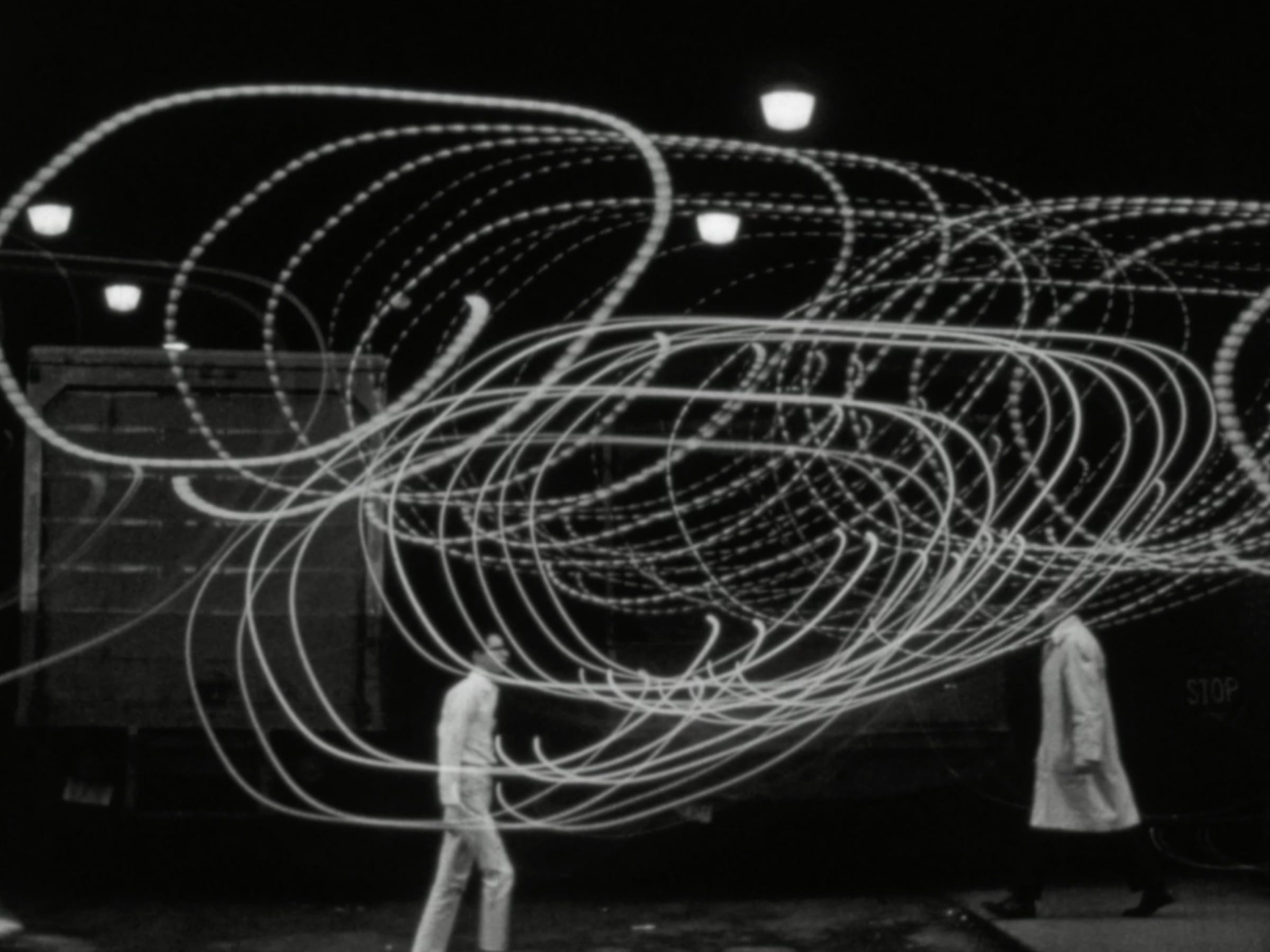
Personal Legacies: Materiality and Abstraction brings together personal and experimental films made by artists who worked for the design studios and corporations highlighted in the other programs of the series. This program traces a lineage of film practice that emerged from the main tenets of the New Bauhaus – the marriage of design, function and utility. Both Mort and Millie Goldsholl studied under Moholy-Nagy and subsequently employed young Chicago filmmakers for their new Film Division at Goldsholl Design Associates. Filmmakers from this generation, including Byron Grush, Larry Janiak, and Robert Stiegler, went on to become major participants in the continued development of film studies and production at the Institute of Design and the University of Illinois Chicago’s Photography Division. Dan Bashara, Instructor in the Cinema & Media Studies Program at DePaul University, introduced the screening and discussed the impact of the work of artists, designers, educators, writers, and theorists György Kepes and László Moholy-Nagy on the generation of filmmakers represented in this program.
György Kepes and László Moholy-Nagy’s writings on vision and modernity had a lasting impact on the development of design programs in the mid-century. Two foundational books, Kepes’ Language of Vision (1944) and Moholy-Nagy’s Vision in Motion (1947), defined their vision for what design ought to be doing, and quickly became integrated into design curricula in Universities across the country. For Kepes and Moholy-Nagy, the idea of vision itself was central—they wanted to rehabilitate vision and to improve it, and they made this the goal for design programs including Moholy-Nagy’s New Bauhaus.

Kepes and Moholy-Nagy were both concerned with the increasing visual complexity of the world and acknowledged that there was simply more to look at than there had been in the past. Kepes wrote: “…to orient oneself in the metropolis of today, among the intricate dimensions of streets, subways, elevated trains, and skyscrapers, requires a new way of seeing.” Concerned with the fundamental aspects of vision, the implication is that the modern world has changed and we haven’t yet caught up.
Graphic design in this period was also influenced by advancements in science and technology, in particular scientific modes of visualization—the cosmic and the microscopic, the transparent and the multidimensional. Both Kepes and Moholy-Nagy claim that old modes of vision were being used to look at a new world, and, as a result, modern subjects were only seeing part of the world. Part of their thinking in this period reflected the idea that design could expand our range of vision and retrain our senses, in particular what they referred to as our “public vision.”
The films in this program emerged from this environment—one that was steeped in the idea of educating vision and training the senses, and one that was driven by a desire to experiment with new ways of seeing the world. Artists and designers wanted to transform the way people saw and experienced urban and natural spaces, cars and human beings, metal and water, concrete and pure light. Design thinking during this period wasn’t just concerned with consumer products and corporate logos—it wasn’t really about things at all—it was about vision.
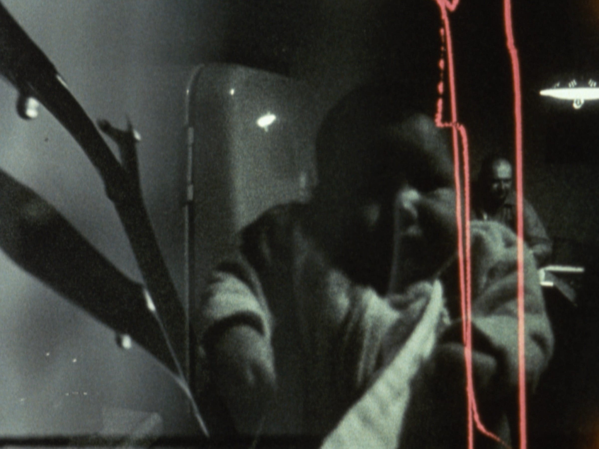
These are films that capture light. They don’t aim to merely capture buildings or the material supports of light, but, rather, abstract representations and movements of light and color. These are films that want to teach us how to see the world differently and that trouble our expectations of what a film should do. Editing, cinematography, and other elements of film technique are used to render us disoriented and uncomfortable. Stories, plots, and characters are not at the core of these films, nor are recognizable objects. Sometimes cars and trees and buildings will appear, only to be distorted, stretched, fragmented, splintered, and then recombined in ways that move beyond traditional ways of seeing, representing, and thinking about the world. The desired effect is that cars and trees and buildings become abstract forms—the world has been defamiliarized and we struggle to recognize and make sense of the world that we are looking at. This struggle forces us to focus on abstract form, on matters of light and line, and on color. When we are able to do this, then the difference between things—the difference between material objects—begins to dissolve as everything becomes joined in a vast network of light, color, and movement.
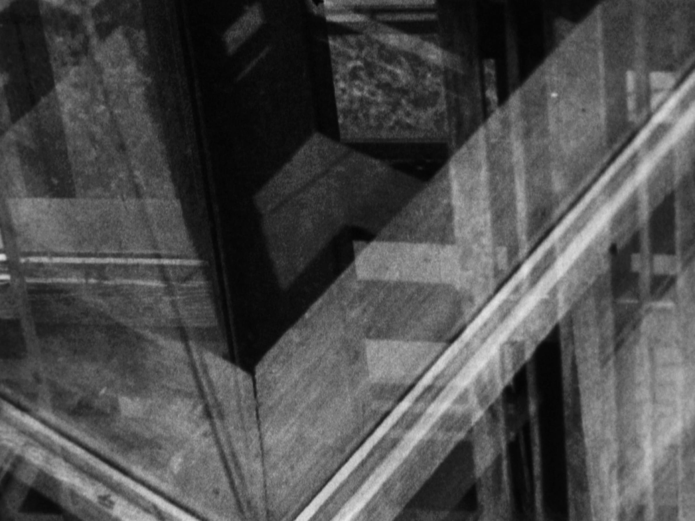
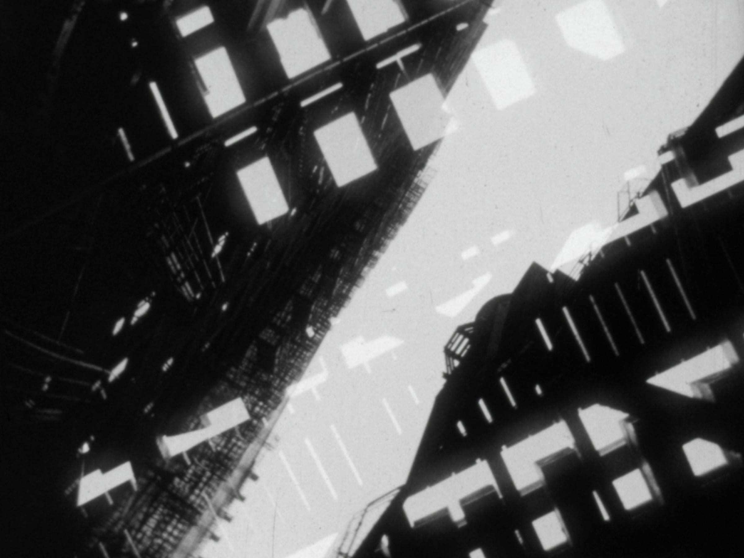
These films teach us to view light, color, and movement as abstract forces that we can no longer take for granted. The longer we watch them, the more our vision is stretched and challenged. The more our vision expands beyond the boundaries and expectations that we came into the theater with. We adapt and begin to see things differently and in a new way.


Ideally we then carry this expanded vision out into the world with us when we leave the theater. Everything looks a little bit … weirder. The world looks like it’s been shifted just a couple of degrees and we are suddenly able to pay attention to abstract forms. For the designers and filmmakers in this program, this means that we are seeing better. We are seeing more completely and have a more holistic view of what makes up the world around us. The goal of this work is to shake us out of a kind of complacency—a complacency that blinds us to the abstract beauty of the world. It wants to offer us a different understanding of how the various parts of the world fit together. The boundaries between things—between ourselves and others, between our bodies and those around us—start to fall away as our vision changes. The categories that we use to keep things separate (human, nature, technology, etc.) dissolve. The goal of this new vision is not just to teach us to see better, but, as an extension, to teach us how to live and be in the world better. How to fully participate in the world, get back into harmony with our surroundings, and put different things back onto the same plane of existence.
Toward the end of Larry Janiak’s Adams Film, we see images of a family—people gathered together inside and a baby in a man’s arms. The importance of this moment in the film is that none of this “design thinking” is just about high-level theory. This is not about abstract concepts and philosophers who understand the intricacies of perception better than we do. This is about everyday life. It is about how we, in our most ordinary and private moments—driving our cars, walking down the street, sitting in a park—fit into larger networks and circles of existence. Design can teach us how to see these things differently and how to respond to the world as it exists in the current moment. It teaches us how to cope with the world—how to understand it, manage it, direct it, and make it ours.
These are films that attempt to shift our perception and to capture lived experiences. The world as we knew it before falls away, and our vision is expanded. Multiple impressions pass before our eyes—images are superimposed and distorted. The world fragments into kaleidoscopic bits. Then, when we leave the theater and go back out into the modern world, we see things differently. Kepes and Moholy-Nagy wanted us to break out of our visual habits and replace them with new ways of seeing, and the films in this program emerge from this larger design project—they push us into new and more radical ways of seeing and experiencing the modern world.


